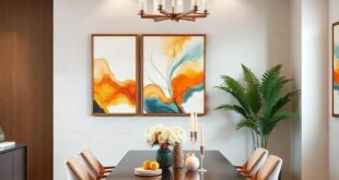
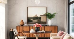
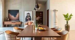
Your dining room is more than just a place to share meals; it’s a canvas for cherished memories, celebrations, and conversations. If your dining area feels simple or stagnant, a fresh coat of paint can work wonders, turning it into a stylish retreat that reflects your personality and enhances your dining experience. In this listicle, we’ve curated 21 stunning wall paint colors that promise to breathe new life into your space.From serene pastels to bold, striking hues, each color offers its unique flair and atmosphere. You can expect to discover a diverse palette of options, complete with insights on how each shade can affect the mood of your dining room. Whether you’re seeking a cozy and intimate vibe or a vibrant and energizing atmosphere, our list will inspire you to make the perfect choice for your home. Let’s dive in and find the ideal hue to set the stage for your next gathering!
soft Sage Green: A calming hue that evokes the tranquility of nature, perfect for creating a refreshing atmosphere

Imagine stepping into a dining room that instantly envelops you in a soothing embrace.The gentle tones of soft sage green serve as a reminder of verdant hills and whispering leaves, invoking a sense of serenity that transforms mealtime into a peaceful retreat. This tranquil hue not only evokes the essence of nature but also pairs beautifully with a variety of décor styles, from rustic charm to modern elegance. It effortlessly enhances your space, making every dining experience feel like a serene escape.
To accentuate the calming influence of this color, consider incorporating a few complementary elements:
- Natural Textures: Woven baskets or wooden tableware can introduce tactile warmth.
- Fresh Greenery: Potted plants or herb arrangements add life and an organic touch.
- Soft Accents: Introduce cushions or fabric drapes in lighter tones to enhance the overall ambiance.
| Element | Color Pairing | Effect |
|---|---|---|
| Wood Furniture | Warm Oak | Provides grounding and stability |
| Artworks | Muted Earth Tones | Creates an inviting focal point |
| Table Settings | soft Whites | Adds elegance and lightness |
Deep Navy Blue: Adds a touch of sophistication and drama, making the dining space feel luxurious and inviting

indulging in a deep navy blue hue for your dining room walls brings an unparalleled sense of elegance and charm, effortlessly blending with both contemporary and classic decor styles.This rich color acts as a backdrop that enhances the beauty of your furniture, artwork, and accessories. When illuminated by soft lighting, it casts a beguiling glow that invites warmth and intimacy, making dinner parties and family gatherings feel truly special.
Pairing navy blue with accents of gold or brass can elevate the space to a new level of sophistication. Consider using white trim and light wood furniture to create contrast and balance. Additionally, using textured fabrics, such as velvet or silk in coordinating shades, can further enhance the luxurious vibe.Here are a few elements that beautifully complement this striking color:
- artwork: Bold, abstract pieces with hints of gold or metallic framing
- Table Linens: Crisp white or patterned table runners
- Lighting: Chic pendant lights or chandeliers with a modern touch
warm Terracotta: This earthy tone brings warmth and a hint of rustic charm, ideal for creating a cozy gathering place

Embracing the allure of terracotta can transform your dining room into a warm sanctuary. this rich,earthy hue not only evokes a sense of comfort but also infuses your space with a hint of rustic charm. Perfect for creating an intimate atmosphere,warm terracotta pairs beautifully with natural materials like wood and stone. Imagine hosting dinner parties surrounded by the inviting glow of terracotta walls, complemented by cozy textiles and warm lighting, setting the perfect backdrop for gatherings with friends and family.
To enhance the cozy gathering place effect, consider using warm terracotta in combination with other earthy tones.Here are a few complementary colors that can elevate your dining experience:
- Soft Cream: To lighten and balance the richness of the terracotta.
- Warm Taupe: Adds sophistication while maintaining a warm ambiance.
- Olive green: Brings a touch of nature inside, perfect for a farmhouse feel.
| Color | Perfect Pairing |
|---|---|
| Warm Terracotta | Soft cream |
| Warm Terracotta | Warm Taupe |
| Warm Terracotta | Olive Green |
Dusty Rose: A soft, muted pink that infuses elegance and charm, perfect for a romantic dining setting

Imagine stepping into a dining room washed in a gentle hue that whispers elegance and romance: a soft, muted pink that beckons for intimate gatherings and celebratory dinners alike. This delicate shade evokes feelings of warmth and serenity, making it an ideal backdrop for long conversations over candlelight. To elevate the charm, consider pairing this color with deep wooden furniture or brushed gold accents, creating a stunning visual contrast that enhances the inviting atmosphere of your space.
To complement this enchanting tone,incorporate a variety of textures and décor elements that echo its sophistication. Here are a few suggestions:
- Soft Fabrics: Think flowing drapes and plush cushions in cream or soft gray.
- Elegant Tableware: Opt for white porcelain with delicate floral designs.
- artistic Touches: hang framed art prints or photographs that incorporate warm earth tones.
Incorporating natural elements like potted plants or wooden centerpieces can further enhance the ambiance, allowing for a perfect balance between modern elegance and timeless charm. With such thoughtful details, your dining room will not only invite guests to dine but also to linger a little longer, soaking in the atmosphere.
Charcoal Gray: A versatile and modern choice that provides a sleek backdrop for bold artwork and decor accents

Charcoal gray is not just a color; it’s a statement. Its deep, rich hue offers an elegant canvas that effortlessly elevates the aesthetic of any dining room. This sophisticated shade creates a sense of calm and balance, making it an ideal backdrop for showcasing vibrant artwork and striking decor accents. With its non-intrusive nature, charcoal gray allows you to explore various design themes—from contemporary minimalism to eclectic charm—while still feeling cohesive and stylish.
When decorating with charcoal gray, consider pairing it with elements that pop. Think bold artwork featuring bright colors or unique textures to add a dramatic flair. Incorporate metallic accessories like gold or silver to enhance the elegance and depth of the gray walls, creating a chic and inviting atmosphere. Elements such as wooden dining furniture or soft textiles in contrasting shades will further enrich the space, ensuring that your dining area remains both functional and visually striking. Below are some complementary colors to consider that will harmonize beautifully with charcoal gray:
| color | Description |
|---|---|
| Mustard Yellow | A warm contrast that adds brightness and energy. |
| Turquoise | A refreshing pop that brings a lively touch. |
| Coral | A soft yet vibrant hue, perfect for a welcoming feel. |
| Ivory | A classic pairing that softens the boldness of gray. |
Light Aqua: A breezy, relaxed color reminiscent of coastal retreats, offering a refreshing vibe to your dining experiences

Invoking the essence of sun-kissed shores, this vibrant hue envelops your dining area in a soothing aura. Imagine sipping coffee as the soft light dances across your table, echoing the gentle waves of a coastal retreat. This shade, akin to tropical waters, harmoniously blends with natural materials, allowing elements like wood and stone to shine. It effortlessly creates a refreshing atmosphere,making meals feel like an escape from everyday life.Enhance the breezy vibe by incorporating white decor accents, such as tableware or light fixtures, to create a stunning contrast that highlights the tranquility of the light aqua.
To fully embrace the coastal retreat theme, consider adding carefully curated decorative elements that complement the serene palette:
- Natural textiles: Linen table runners or cotton napkins in neutral shades.
- Coastal artwork: Sea-inspired paintings or nautical-themed wall hangings.
- Indoor plants: Succulents or ferns that echo the lushness of seaside gardens.
These additions not only enhance the aesthetics but also invite a sense of calm and relaxation, transforming your dining room into a stylish sanctuary designed for tranquil gatherings and leisurely meals.
Golden Yellow: Bright and cheerful,this sunny shade can uplift the mood of any meal,encouraging conversation and laughter

Imagine stepping into a space painted in golden yellow, where the warmth of the sun seems to linger even indoors. This vibrant hue is not only visually appealing but also has a remarkable ability to lift spirits and promote a joyous ambiance. It’s a color that invites you to sit down, share stories, and savor every bite, making it perfect for family dinners or lively gatherings with friends. The radiant shade acts as a backdrop for lively conversations, inspiring laughter and a sense of companionship that resonates deeply within the heart of your home.
Incorporating golden yellow into your dining room can transform the atmosphere completely.Pair this cheerful color with natural wood tones or soft whites to enhance its brightness while grounding the overall design. You could even accessorize with decorative touches like sunflower centerpieces, bright tableware, or golden light fixtures that reflect the optimism of your wall color. For a harmonious effect, consider using a selection of the following decor elements:
- Textured Fabrics: Add cushions or table linens in varying shades of yellow.
- Artful Accents: Hang vibrant artwork that complements the sunny walls.
- Greenery: Incorporate potted plants to balance the color with natural life.
Rich Burgundy: A deep and refined color that exudes sophistication, ideal for formal dining areas or intimate settings

Rich burgundy is more than just a color; it’s an experience. This deep,velvety hue brings an air of sophistication that is both inviting and elegant,transforming ordinary dining areas into remarkable sanctuaries. When used on walls,it creates a dramatic backdrop that enhances the warmth of candlelight and the glow of fine china. Couples and families gathering for intimate dinners will immediately feel enveloped in an atmosphere that encourages connection and conversation. The beauty of this color lies not only in its depth but also in its versatility, complementing a wide range of furnishings from rustic wooden tables to sleek modern designs.
To effectively incorporate rich burgundy into your dining space,consider the following tips for a harmonious aesthetic:
- Accent with Neutrals: Pair burgundy with soft whites or creams to highlight its richness without overwhelming the senses.
- Layer Textures: Incorporate textiles like velvet cushions or silk table runners that echo the opulence of the color.
- Lighting Matters: Use warm, ambient lighting to soften the boldness of the walls, creating an inviting glow.
- Artistic Touches: Add artwork that features hints of burgundy to create a cohesive look that ties the room together.
For a rapid visual reference to explore different styles that can harmonize with this captivating color, check out the table below:
| Style Element | Recommended Pairing |
|---|---|
| Furniture | Light Oak or Whitewashed Wood |
| Textiles | Gold or Cream Fabrics |
| Artwork | Abstract Pieces with Reds and Golds |
Crisp White: timeless and classic, a bright white can open up the space and create a clean canvas for colorful dining accessories

Choosing a radiant shade of white for your dining room walls creates an inviting atmosphere that feels both spacious and sophisticated. This classic hue serves as an exceptional backdrop, allowing your dining accessories to shine brightly. Whether it’s a vibrant tablecloth, angular serving dishes, or an array of colorful artwork, the interplay between the crisp walls and lively decor can easily turn your dining space into a visual feast. A bright white encourages natural light to reflect throughout the room, enhancing the overall ambiance and ensuring that every meal is bathed in a warm glow.
To maximize the potential of this elegant color, consider layering various textures and shades of white in your furnishings. You might pair the walls with sleek metallic accents or introduce soft textiles in shades of cream or ivory. Here are some captivating ideas to elevate your white walls:
- Vibrant Artwork: Incorporate bold paintings or prints that pop against the white backdrop.
- Colorful Table Settings: Use brightly colored plates and napkins to add lively splashes of personality.
- Statement Fixtures: Opt for eye-catching light fixtures in contrasting colors or materials to create visual interest.
Pale Lavender: A soft, soothing shade that introduces a whisper of elegance and a sense of calm to your dining room

imagine stepping into a dining room enveloped in a soft hue that instantly calms the senses and invites warmth. Pale lavender achieves exactly that, creating a backdrop that is both inviting and graceful. This shade serves as a versatile canvas, effortlessly pairing with muted earthy tones or metallic accents, enhancing any decor style from modern chic to rustic elegance. The gentle tone of pale lavender not only brightens the space but also encourages relaxation, making it the perfect setting for long dinner parties or quiet family meals.
The elegance of pale lavender is heightened by its ability to reflect light, filling your dining area with a warm, ethereal glow. To amplify its soothing qualities, consider incorporating accents such as soft white table linens, dark wood furniture, or tranquil floral arrangements. The interplay of these elements creates an oasis of calm, allowing the dining room to transform into a stylish retreat where every meal feels special. Here are some decor ideas that complement this lovely shade:
- Soft gray tableware – Adds depth while maintaining a serene color palette.
- Plush lavender cushions – Enhance comfort and invite relaxation.
- Brushed gold accents – Introduce a touch of luxury without overwhelming the space.
Forest Green: This deep, saturated color brings a slice of the outdoors in, creating a rich and inviting ambiance

Embracing a deep, saturated hue, this color breathes life into your dining space, fostering a connection to nature that infuses every meal with warmth and serenity. Rich green shades create an inviting atmosphere, perfect for long dinners filled with laughter and conversation. Imagine the conversion as the color envelops the room, paired with earthy accents that enhance its beauty. Adding elements of wooden furniture, natural textiles, and potted plants can elevate the outdoor essence, making your dining room feel like an extension of a tranquil forest.
When considering this captivating color, think about how it harmonizes with various décor styles—from modern minimalist to rustic farmhouse. To enhance its richness, you can opt for complementary colors such as:
- Warm Neutrals: Soft beige or creamy whites create a pleasant contrast.
- Metallic Accents: Gold and bronze add a touch of elegance and sophistication.
- Bright Hues: Pair with vibrant table settings or art to infuse energy into the space.
To further inspire your design journey, consider the following color palette that works beautifully with this deep green:
| Color | Hex Code | Best Pairing |
|---|---|---|
| Soft Beige | #F5F5DC | Furniture |
| Gold Accents | #FFD700 | Decor |
| Creamy White | #FFFFF0 | Trim |
Warm Beige: A neutral yet cozy option that pairs well with a variety of styles and allows for flexibility in decor

Warm beige offers the perfect balance between neutrality and comfort, making it an ideal backdrop for a variety of styles.Whether your dining room leans towards customary elegance or modern minimalism, this inviting hue enhances the overall ambiance without overwhelming the senses. Its versatility allows you to easily switch up your decor—think plush table runners, vibrant tableware, or eye-catching artwork. The soft undertone of this shade creates a serene environment, making it a welcoming space for family gatherings or intimate dinners with friends.
One of the greatest advantages of warm beige is its ability to harmonize with a myriad of color palettes. It pairs beautifully with rich earth tones, soft pastels, and even bold jewel tones, offering endless possibilities for styling. Consider these complementary accents to enrich your dining experience:
- Dusty Rose for a romantic touch
- Olive Green to bring a splash of nature indoors
- Charcoal Gray for a grounded look
- Mustard yellow to add a cheerful vibe
As you transform your space,remember to play with textures and patterns. Incorporating different materials—like a wooden dining table, brushed metal fixtures, or even soft fabrics—will create a layered effect that enhances the cozy atmosphere fostered by your warm beige walls.
Slate Blue: A muted blue-gray that offers cool sophistication while remaining approachable and grounded

Embrace the calming allure of slate blue, a color that artfully balances warmth and coolness, making it an ideal choice for transforming your dining room into a stylish retreat. This muted blue-gray hue exudes sophistication while ensuring your space remains inviting. By choosing slate blue, you can enhance the overall ambiance, providing an elegant backdrop that seamlessly complements both modern and traditional decor elements. Its versatility allows it to pair harmoniously with a variety of accent colors such as soft whites,warm wood tones, and rich metallics,making your dining area a true reflection of your personal style.
As you envision your freshly painted walls, think about the textures and materials that slate blue can highlight, such as natural fabrics and organic elements. This shade works exceptionally well with dining tables and furnishings of various materials, enhancing their beauty without overpowering them. Here are some key attributes of slate blue to consider when planning your design:
- Timeless Elegance: A color that never goes out of style.
- Calming Effects: Promotes relaxation, perfect for mealtime gatherings.
- Grounded Sophistication: Maintains an approachable vibe in any setting.
Eggshell Blue: Soft and airy, this refreshing hue breathes life into the space, reminiscent of sunny skies

Embrace a sense of tranquility in your dining room with a shade reminiscent of clear blue skies. This gentle color brings a refreshing breath of airiness, perfectly suited for creating a serene atmosphere where friends and family can gather. The calm undertones of this hue offer a subtle background that allows other decor elements to shine, providing a balance between elegance and comfort. Add a touch of brightness with soft white trim or gold accents to elevate the overall aesthetic.
To complement the soothing vibe of this color, consider incorporating a variety of decor styles that enhance its beauty:
- Light Wood Furnishings: Pair with natural wood finishes to introduce warmth.
- Textured Fabrics: Use linens and cottons in shades of cream or pastel for table settings.
- Artistic Touches: hang abstract artwork with complementary blues and whites to add personality.
choosing the right lighting can further amplify the effects of this lovely color. Using warm bulbs can soften the blue and create a cozy environment, while natural light makes this refreshing shade even more inviting. A minimalist chandelier or simple pendant lights can add a modern flair, providing the perfect contrast to the airy walls whilst enhancing the room’s overall ambiance.
Creamy Peach: A warm pastel that adds a cheerful vibe while maintaining a subtle elegance for any dining occasion
Imagine hosting a delightful brunch or an elegant dinner party enveloped in soft, invigorating shades of peach. This peach hue brings warmth to your dining space, instantly transforming it into a haven of comfort and cheer. Its gentle undertones meld seamlessly with both traditional and modern decor,making it a versatile choice for any aesthetic. Whether paired with crisp whites or deeper, richer accents, this color radiates positivity and creates an inviting atmosphere that encourages relaxation and connection over a meal.
To enhance the serene elegance of your dining room, consider incorporating thoughtful decor elements that complement the softness of peach. Here are some ideas to inspire your styling:
- Natural Textures: Utilize wooden furniture and woven accents to contrast and enrich the mellow undertones of the paint.
- Artful Accessories: Select pastel or metallic decor items that add a subtle glamour, harmonizing with the peach backdrop.
- Botanical Touches: Fresh flowers or green plants not only brighten the room but also bring life and freshness to the environment.
Steel Blue: A calming, modern alternative that evokes a sense of stability and serenity in a stylish way

Imagine stepping into your dining room, where every shade of steel blue whispers tranquility. This versatile hue effortlessly blends modern aesthetics with a sense of calm, transforming any dining space into a serene retreat. Whether you prefer a light, airy look or a deeper, more sophisticated tone, steel blue is a fantastic choice that pairs beautifully with various decor styles. It brings a harmonious balance to the room, making it an ideal backdrop for sharing meals and moments with loved ones.
Incorporating steel blue into your dining room can be achieved through various design elements that enhance its serene appeal:
- Accent Walls: Create a striking focal point by painting one wall in steel blue while keeping the others in complementary neutrals.
- Furniture and Decor: Consider incorporating steel blue accents through upholstered chairs,table linens,or artwork,creating a cohesive and stylish vibe.
- Natural Elements: Pair steel blue with natural wood finishes or lush greenery for an organic sophistication that further enhances the calming ambiance.
| Element | Steel Blue Pairing |
|---|---|
| walls | Soft whites or grays |
| Furniture | Natural wood tones |
| Accessories | Gold or brass accents |
| Textiles | Muted pastels |
Almond Brown: A warm and inviting neutral that adds depth and a feeling of comfort in your dining area

The appeal of Almond Brown lies in its ability to create a sense of warmth and comfort in your dining area. This soft,earthy hue evokes feelings of coziness,making it perfect for family gatherings or intimate dinner parties. Imagine the inviting ambiance it creates, enveloping your space with a subtle richness that complements various styles, from rustic to modern chic. Consider pairing it with natural wood accents or rich textiles for an enhanced effect that encourages relaxation and conversation.
To maximize the aesthetic potential of this delightful shade, consider the following design tips:
- Coordinating Colors: Pair with creamy whites or soft beige for a harmonious palette.
- Textural Contrast: Introduce different textures such as linen tablecloths or woven baskets to add dimension.
- Lighting Matters: Use warm lighting fixtures to enhance the cozy vibe of Almond Brown.
In addition, accent colors like sage green or dusty rose can invigorate the space, making it a lively yet serene retreat. Here’s a quick reference table for your design considerations:
| Accent Color | Effect |
|---|---|
| Sage Green | Brings an organic touch and freshness. |
| Dusty Rose | Adds a hint of romance and warmth. |
| Cool Gray | offers a modern contrast and sophistication. |
Vibrant Teal: A bold and energetic choice that can energize the atmosphere, perfect for casual gatherings

Imagine stepping into a dining room bathed in vibrant teal, a color that exudes a sense of energy and liveliness. This bold hue instantly transforms the space into an inviting haven, making it perfect for casual gatherings with friends and family. Teal’s refreshing quality can elevate the atmosphere, encouraging conversations and stimulating creativity, ideal for sharing a meal or hosting a game night. To enhance the appeal further, consider pairing this dynamic shade with a variety of textures and patterns, from cozy linens to striking tableware.
When you embrace teal in your dining room, consider complementing it with touches of gold, white, or natural wood for a harmonious balance. Here are a few styling tips to maximize the impact of your vibrant walls:
- Accent pieces: Incorporate gold or brass accents through light fixtures or decorative items.
- Wall art: Select artwork with hints of teal to create a cohesive look that ties the room together.
- Plant life: Introduce greenery to contrast beautifully against the vivid walls, enhancing the overall freshness.
All in all, the energetic allure of teal can breathe new life into your dining area, making it the go-to spot for any gathering.
Midnight Black: For a bold statement, this deep shade can create a striking, glamorous backdrop for stunning decor

for those daring enough to embrace the drama of a deep, rich hue, opting for the deep allure of black can redefine your dining space entirely. The color can evoke a sense of sophistication that transforms not just the walls, but the entire atmosphere of the room. Imagine an elegant chandelier casting soft light against a midnight black backdrop; it becomes a perfect canvas, emphasizing the intricate details of your decor while offering a luxurious feel. This color serves as a bold foundation for your dining room, allowing vibrant artworks and carefully chosen decor to pop against its depth.
To create a harmonious yet striking dining experience, consider incorporating the following elements alongside your midnight black walls:
- Metallic accents: Gold or silver fixtures can add a touch of glamour.
- natural Textures: Wood or woven materials soften the intensity of black.
- Bright Tableware: Whites or jewel-toned dishes will stand out beautifully.
- Layered lighting: Combine ambient and accent choices for an intimate feel.
- Floral Arrangements: Fresh blooms can introduce color, creating striking contrasts.
Blush Pink: A soft,romantic hue that brings warmth and coziness,perfect for intimate family dinners or gatherings

Embrace the gentle allure of blush pink, a color that effortlessly evokes feelings of warmth and coziness, making it an ideal choice for intimate family dinners or gatherings. This soft,romantic hue not only complements a wide array of décor styles but also enhances the dining experience by creating an inviting atmosphere. When adorned with accents such as white table linens or deeper, contrasting shades, blush pink transforms your dining space into a sophisticated yet approachable retreat.
A few key elements make blush pink an exceptional choice for your dining room:
- Versatile Pairing: Blush pink pairs beautifully with various colors, from soft whites to rich, dark tones, offering endless styling opportunities.
- Enhanced Lighting: As a lighter shade, blush pink reflects light, making your dining area feel airy and spacious, even in smaller spaces.
- Emotional Connection: This hue creates a soothing environment that encourages conversation and bonding,perfect for those cherished moments around the dining table.
| Complementary Colors | Recommended Accents |
|---|---|
| Soft Beige | Textured Fabrics |
| Deep Navy | Metallic Accents |
| Mint Green | Wooden Elements |
Olive Drab: A unique, earthy color that blends sophistication with a touch of nature, creating an inviting dining retreat

Imagine stepping into a dining room where a warm embrace of rich earthy tones welcomes you. The unique allure of olive drab serves as an elegant backdrop that effortlessly combines the sophisticated with the organic. This color, reminiscent of lush greenery and serene landscapes, creates an atmosphere that invites both relaxation and connection over shared meals. Incorporating this shade can transform your dining area into a refuge where conversations flow as smoothly as the wine.
To enhance the charm of your dining space, consider pairing the olive drab hue with complementary colors and textures that amplify its natural elegance. Here are some intriguing ideas:
- natural Wood Accents: Light or dark wood finishes in furniture and decor contrast beautifully with olive drab.
- Soft Whites: Adding soft white trim or ceilings brightens the room and balances the earthy tone.
- Brass or Gold Fixtures: Metallic elements introduce a hint of luxury, elevating the overall sophistication.
- Plants and Greenery: Incorporate potted plants or hanging greens to amplify the organic feel.
| Color Pairing | Effect |
|---|---|
| White | Brightens and opens the space. |
| Brass | Adds elegance and warmth. |
| Beige | Creates a harmonious, calming environment. |
| Mustard Yellow | Injects vibrancy and energy. |
Concluding Remarks
As we wrap up our exploration of 21 stunning wall paint colors that can elevate your dining room into a stylish retreat, it’s clear that the right hue can do wonders for both your space and your dining experience. Whether you’re drawn to bold and vibrant shades or prefer the soothing embrace of soft neutrals, each color has the potential to create a unique atmosphere that reflects your personal taste.Remember, the walls of your dining room are more than just a backdrop; they set the stage for memorable gatherings, heartfelt conversations, and shared meals. So, take your time in choosing the perfect color, considering everything from your furniture and decor to the natural light in the room.
Now, armed with inspiration from our curated list, it’s time to embrace your creativity and transform your dining space into a stylish haven that invites warmth and joy. Happy painting, and here’s to many delicious moments in your beautifully transformed dining room!
As an Amazon Associate I earn from qualifying purchases.